What's new

Why Would Thater Do This?

Earlier this year I ordered a Thater 4125 with an octagonal handle. I expected the Thater logo on the side, but when the brush arrived it was on the botton. I have no problem with the logo on the bottom. The Shavemac 173 handle, which is also octagonal, has the logo engraved on the bottom. However, Thater is not printing or engraving its logo on the bottom. Rather, it has glued a plastic disc on the bottom of the handle. The plastic disc is black, but the top of it is painted silver. When the lettering tools are pressed against this plastic disc, the result is black lettering against a silver background. It looks like this:

$IMG_20130530_170300_516.jpg

Others may like this but I find it ugly and cheap looking. I took this picture the moment I took out the brush from the box. If you look below and to the left of the 4125, you will see a spot where the silver paint had already flaked off on the new brush.

I can't think of why Thater would do this. It's a beautiful, high end brush that does not deserve such a low end logo.

I'm curious as to how others feel about this.
 
Last edited:
I also think the placement and type of logo on the bottom are not very intelligent. Sooner or later it will degrade, no doubt and then it will look ugly. So I agree, not a good choice.

On the other hand it should have been no trouble at all to return the unused brush right away, if you weren't happy with it. You ordered this brush earlier this year and we are now close to the holiday season for 2013. Starting to complain now might be a little late ...

What I didn't say in my original post is that I immediately returned the brush, and told the vendor my thoughts about the new logo. The vendor, to its credit, gave me excellent customer service on this. They didn't have any more of the size brush I ordered with the old logo. However, they found me a larger version of the brush with the old logo on the side and shipped it to me right away. But I won't be ordering any new Thater with the current logo.
 
I still like the original script logo. Not sure why Thater decided to do all this changing.

Here's a picture of the original script Thater logo.

Picture taken by jkh from this post.

proxy.php


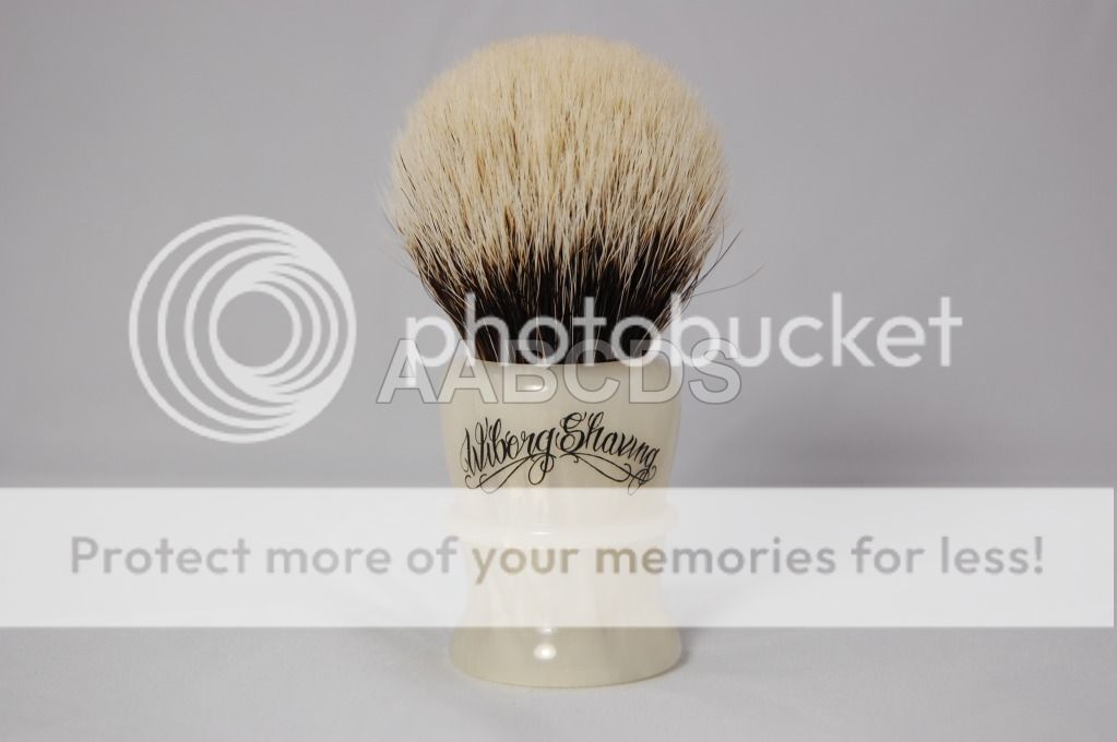
I liked the original Wiborg logo too.

proxy.php
 
Last edited:
I actually really like the idea of the logo being on the bottom of the brush, but I understand the quality concerns you have.
 
I agree that it's cheap looking. I wish they would go back to the previous placement at least. Glad to hear the vendor took care of you though.
 

brucered

System Generated
If they would just cover it with clear acrylic it would change the look tremendously, as well as protect it.

Nope. That still wouldn't fix this atrocity of a logo/sticker.

it looks like a price sticker that should be on the box.
 
Last edited:
That is not progress, sadly.

+1.

I didn't like the original one either, this is how it should look like:


Unfortunately I have traded that brush and I won't be replacing it with that hideous new model!
 
Last edited by a moderator:
I just bought one with the logo on the bottom, I did not return it, it is now my desert island brush. I don't mind the logo on the bottom, given the choice I would prefer the logo on the bottom. However, I wish the logo was engraved onto the handle bottom, I am not a huge fan of the plastic disc. It is a little "cheap" but it certainly doesn't bother me enough to return it.
 
Top Bottom