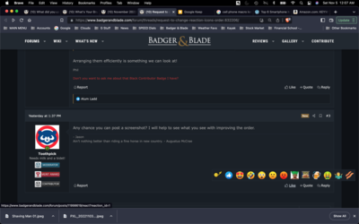
Would it be possible to change the layout of the post reaction icons?
When reacting to others posts the love, like, laugh and wow buttons are far away from the center and the icon bar is narrow.
When reacting while using a laptop computer the narrow band for the icons and the distance away from center make it difficult to click on those buttons. If your mouse strays north or south from the narrow bar then it disappears, this makes it difficult because then you have to go back to the initial like icon to make the bar reappear again and then try again. Sometimes it takes three tries or more.
When doing this from the phone it is not an issue because the icon bar stays in place.
Thanks for your consideration and quite impressed with this great site